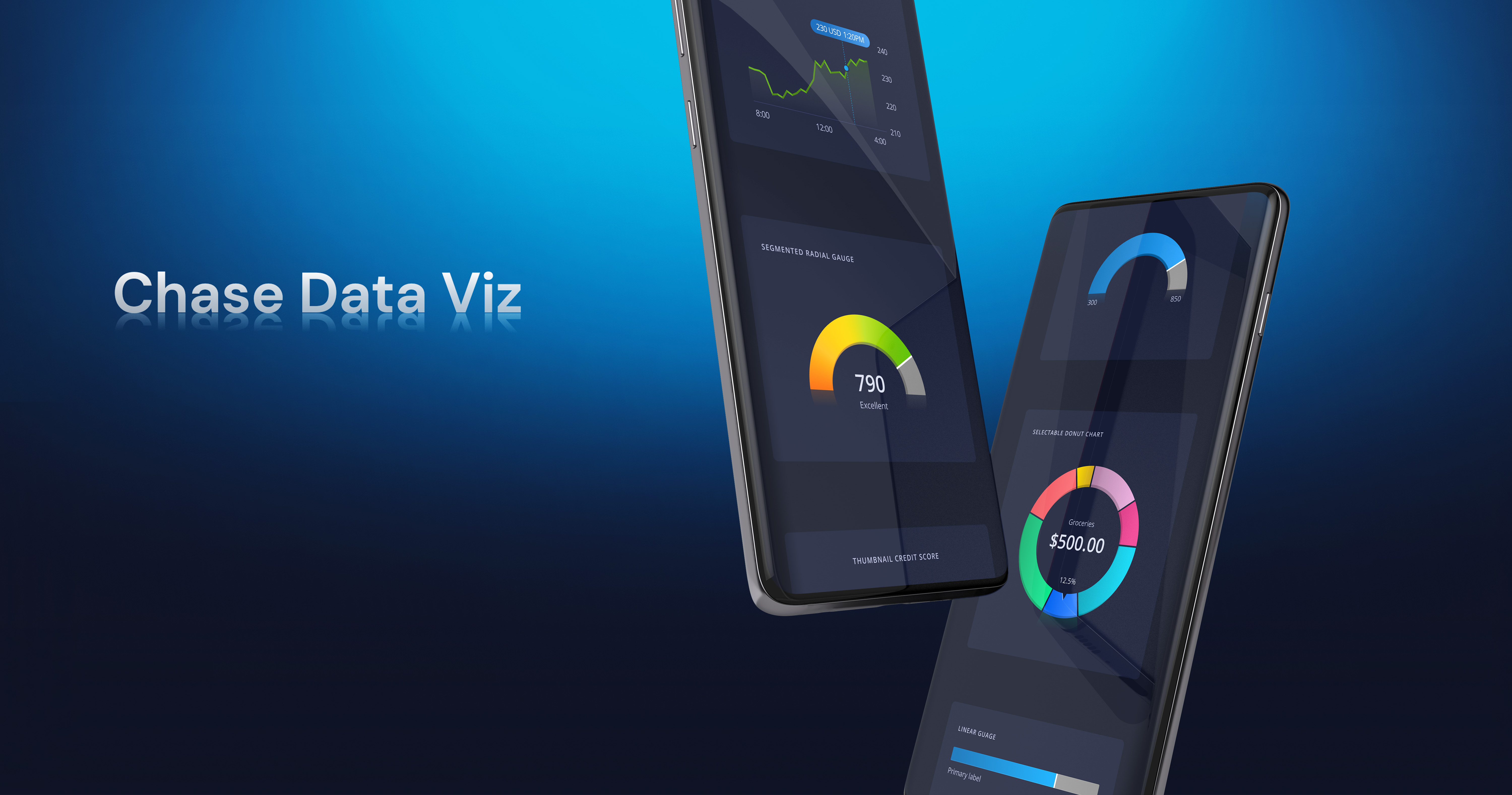
Chase Data Viz
Purpose
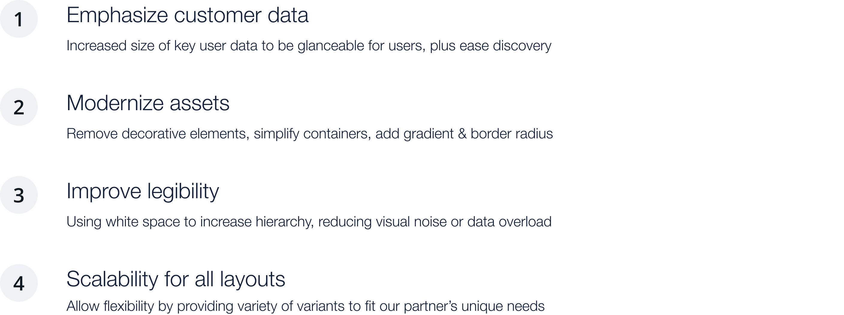
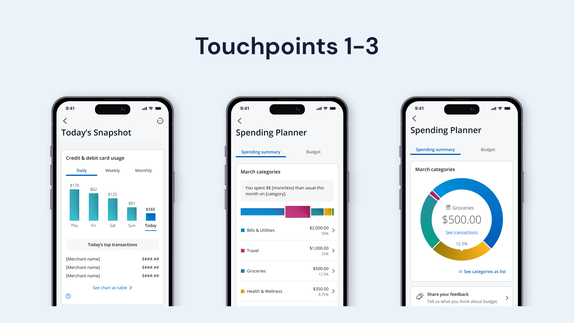
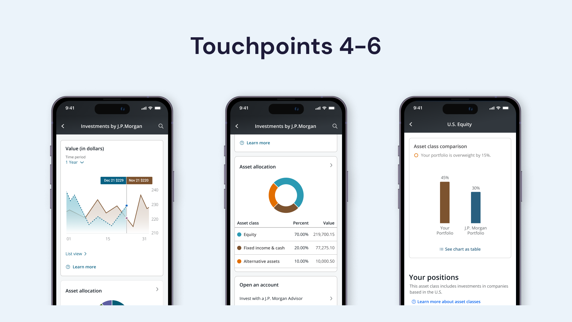
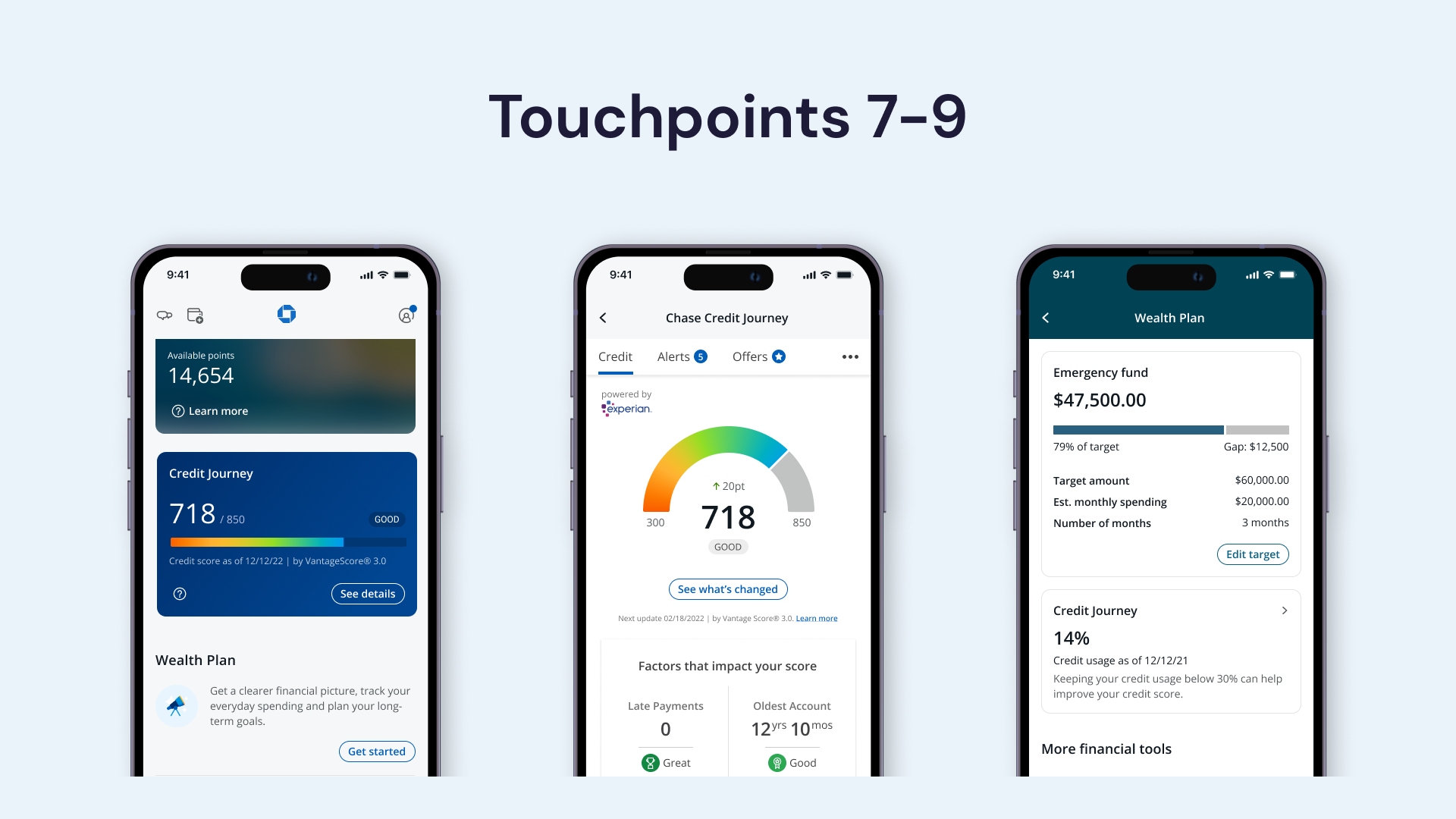
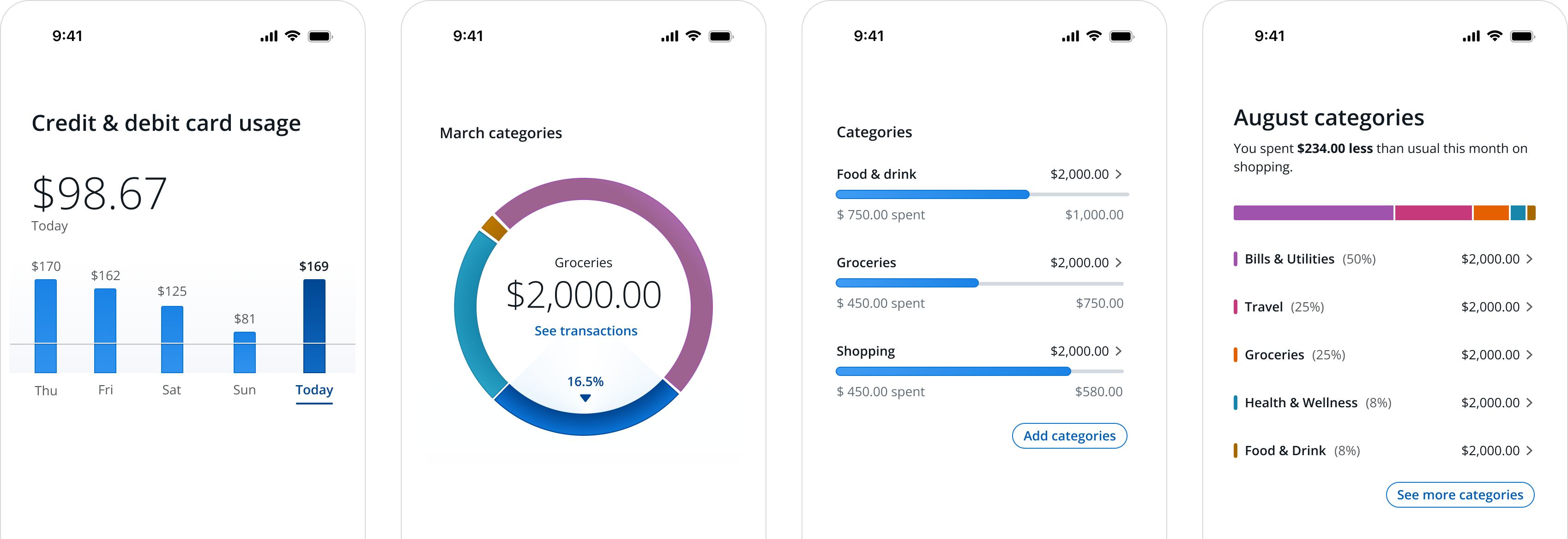
Data is critical to provide users with accurate financial information. This needs to be explained intuitively and made easy to understand. In addition, the aesthetics were improved following Chase's design, North Star. Our goal is to deliver a premium user experience through enhanced data visualization. To create that experience, the tile or contextual layout of the data visualization must be considered to enhance visual hierarchy, clarity and legibility.Challenges
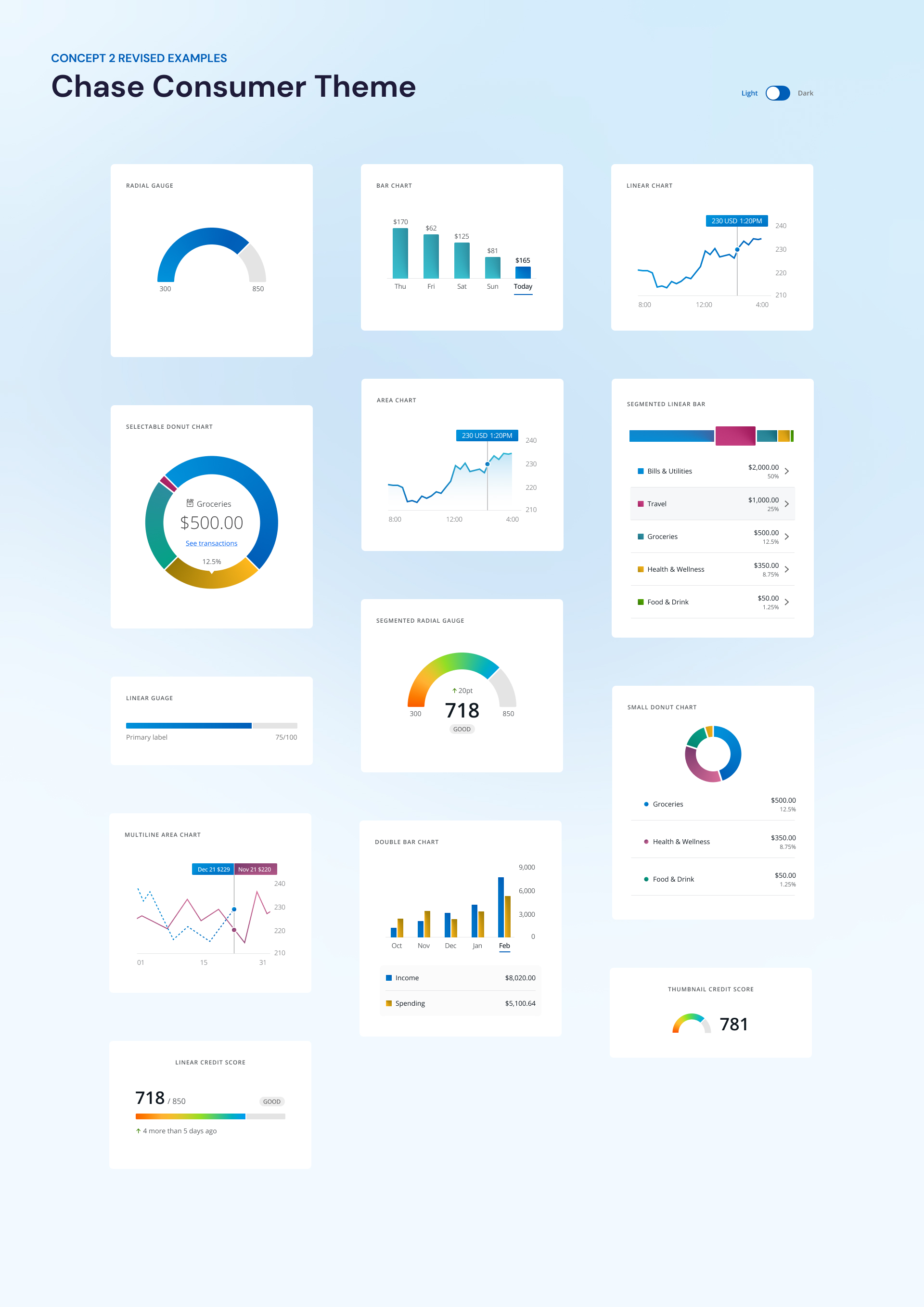
All design elements had to be tokenized and easily applicable to Chase's various brand colors. All elements were minimized to achieve this, but design details were added to create Chase's unique data visual.Our design principles
Concept A
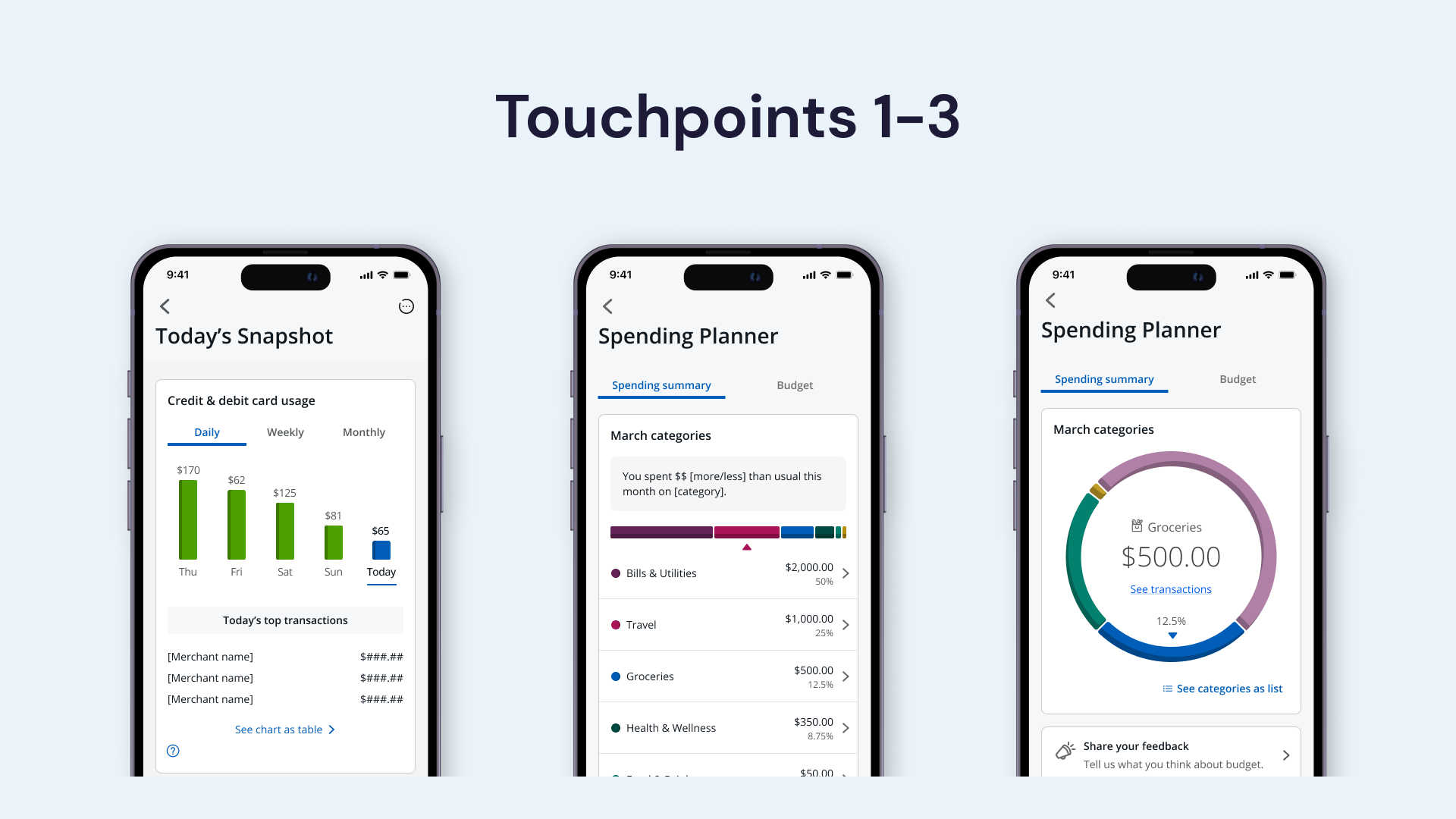
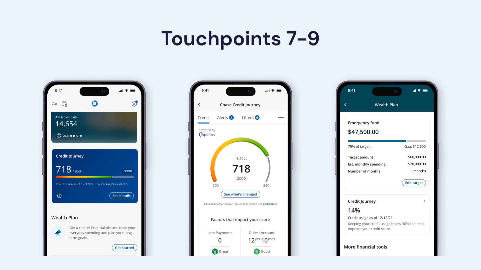
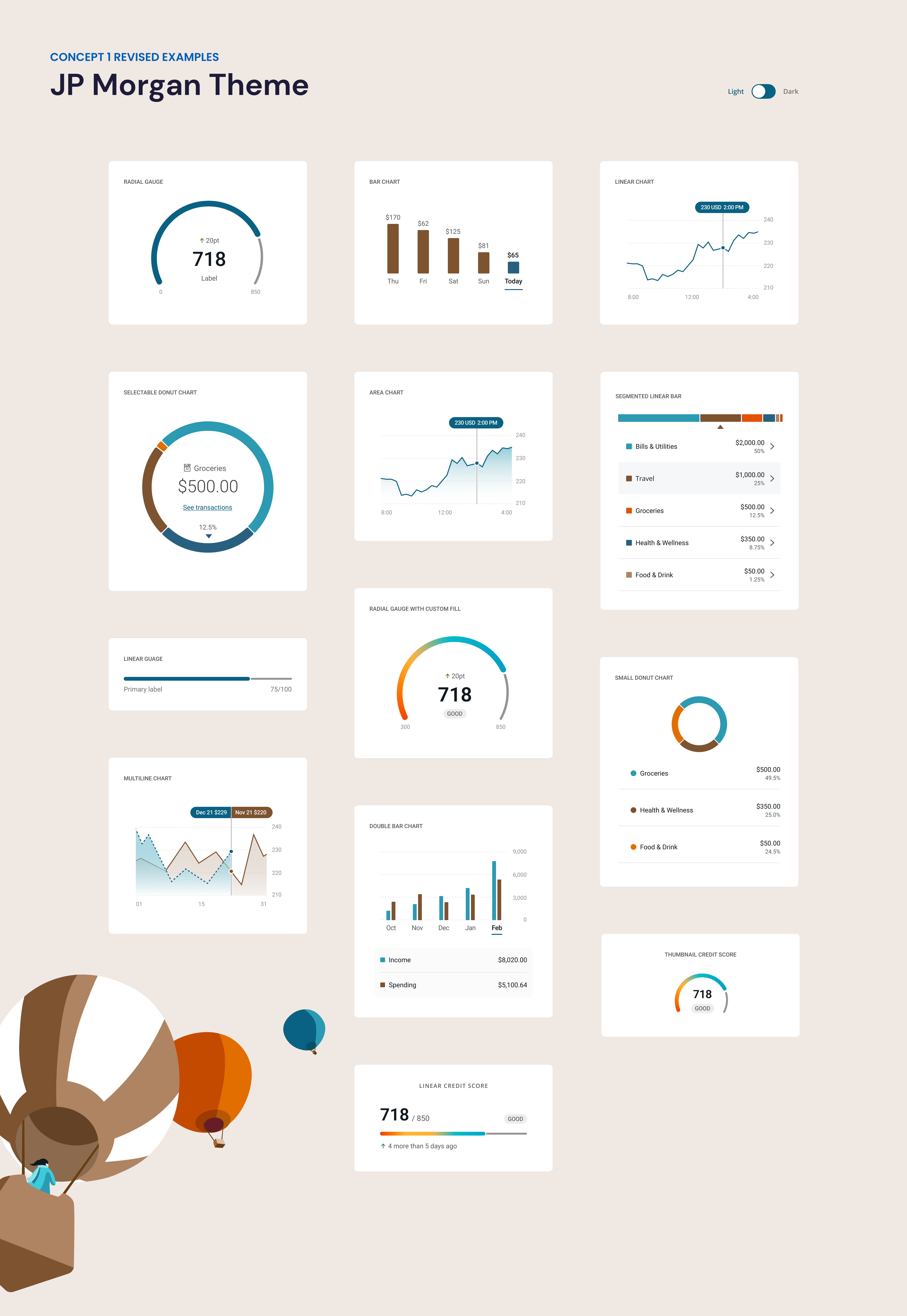
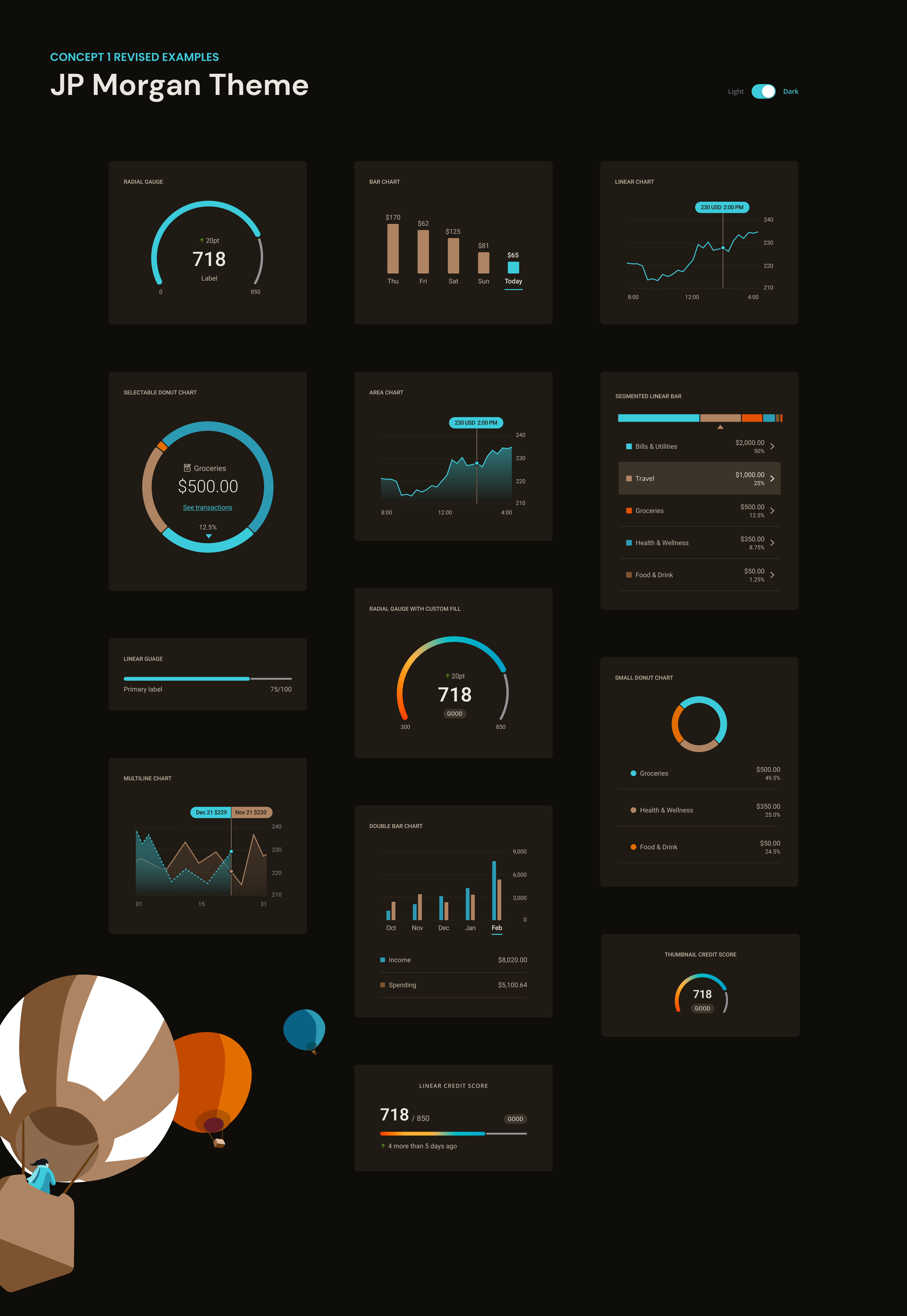
To create the Chase's unique data visualization, we applied the characteristics of Chase's illustrations to add aesthetic elements to the data. The inner shadow was used to bring out the sense of volume, and the colors used in the chase illustration were used to match well with all elements of the chase.


Concept B
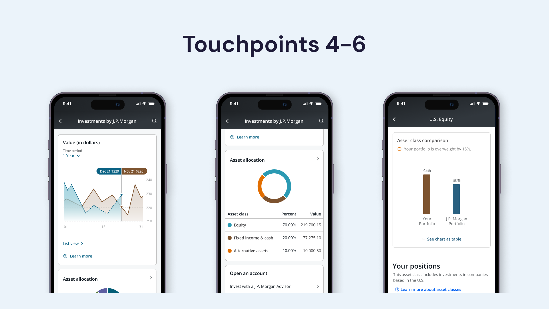
We created a data visualization using gradient, a design element of Chase Plus, Chase's design direction. The movement of data is expressed in the direction of the gradient, and the data can be easily and quickly recognized through bright colors and bold shapes. This design direction harmonizes well with Chase's future direction and enhances the completeness of the digital platform.
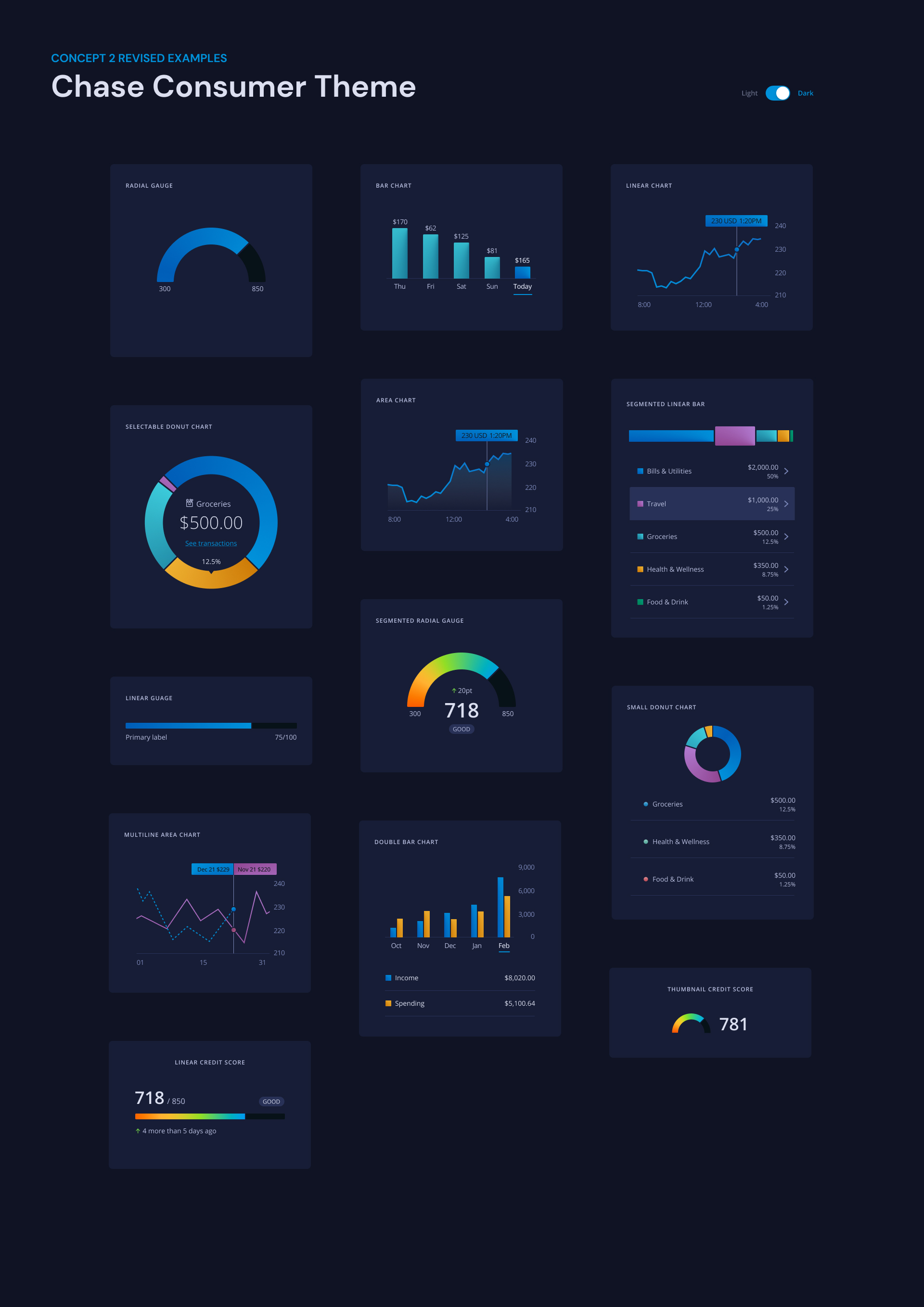
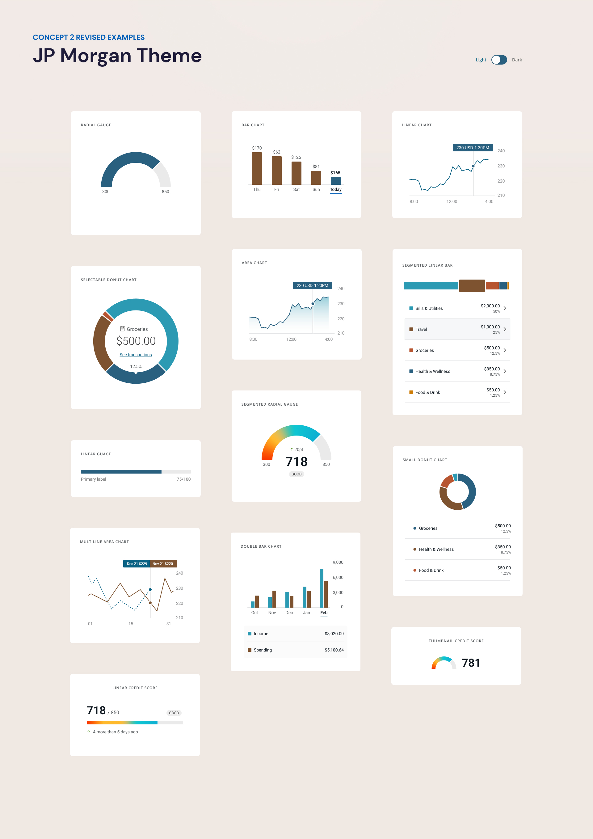
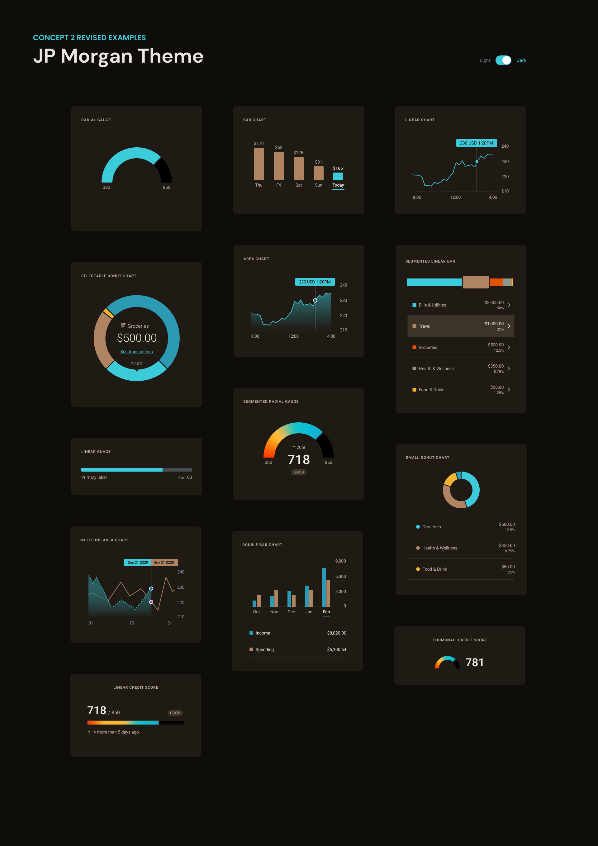
Final Design
Before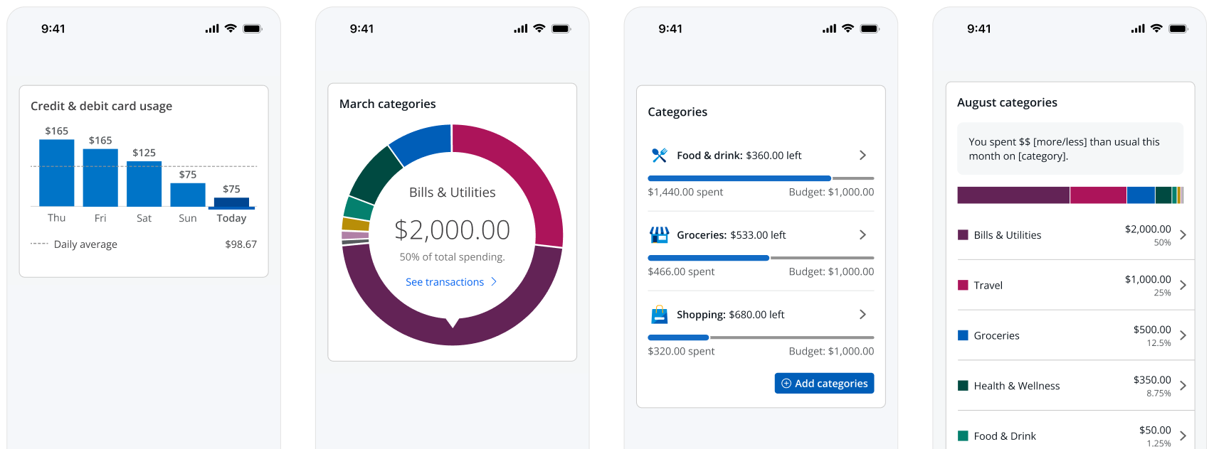
After
Can data be more glanceable?![]()
Skim Charts


